Toggles are something we recommend using sparingly. They should be used for more than a paragraph worth of content and while you can include images and videos, they work best when limited to copy, links, and buttons.
A toggle must extend the full width of the content area and should not be used inside shortcode columns. There are two parts to every Toggle Shortcode: the opening and closing tags.
The opening tag is where you’ll set the text that appears in the toggle. This should be short, descriptive, and make clear to the end user what information is found in the toggle or what will happen when they select the toggle component. by default, the toggle is set to closed state but you can set it to open by changing the open attribute from “false” to “true.”
Be sure to include the closing tag at the end of your content.
Toggle Shortcode
[toggle label="TOGGLE_NAME" open="false"]
[/toggle]
Styling
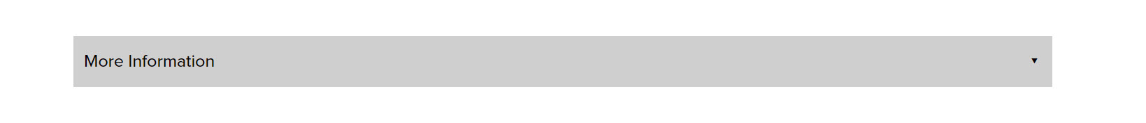
Here is the default toggle style when closed:
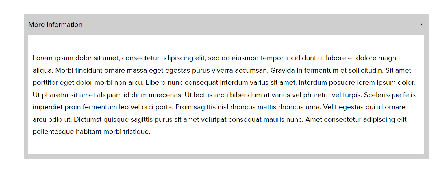
…and here’s the default style when open:
If you’re interested in customizing the style, reach out on Basecamp. Custom styles are free for Pro users and are a small custom fee for Standard and Artist users.